

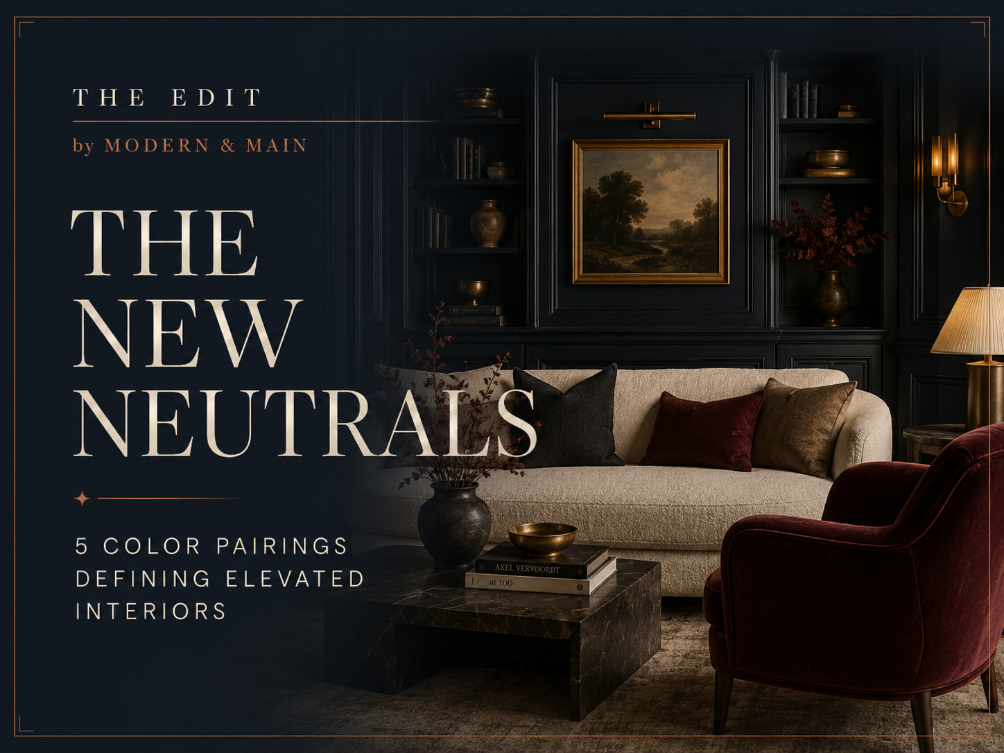
The New Neutrals
5 Color Pairings Defining Elevated Interiors
There was a time when the word neutral meant white, beige, gray, and perhaps a carefully chosen shade of greige.
That definition is changing.
Some of the most compelling interiors today are moving away from overly coordinated spaces and toward rooms with greater depth, warmth, contrast, and personality. Rather than relying on one safe palette throughout a home, designers are layering nuanced color with natural materials, rich woods, aged metals, stone, plaster, and collected pieces.
The result feels less decorated—and much more lived in.
At Modern & Main, we’re particularly drawn to interiors that strike that balance: timeless without being predictable, elevated without feeling precious, and personal without becoming overly trend-driven.
These are five color combinations we’re watching right now.
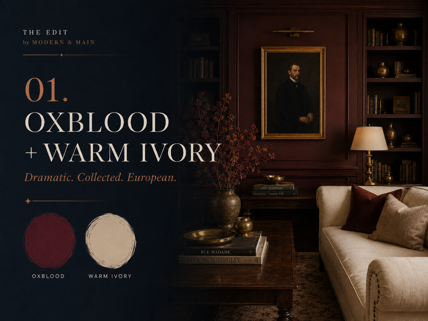
01. Oxblood + Warm Ivory
Dramatic. Collected. European.
Oxblood is one of those colors that instantly gives a room a sense of history.
Deeper than burgundy and warmer than black, it has the ability to make an interior feel established almost immediately. Against warm ivory, however, it never becomes overly heavy.
That contrast is exactly what makes the pairing work.
Creamy plaster walls, pale upholstery, natural linen, and warm stone allow oxblood to become the focal point rather than dominate the entire room.
How to use it
You don’t need an entirely burgundy room to make an impact.
Consider oxblood for a library, lacquered built-ins, a velvet chair, upholstered headboard, kitchen island, or even one beautifully saturated wall.
Then soften it with ivory upholstery, warm whites, natural stone, and aged woods.
The detail that makes it work
Skip anything overly shiny.
Antique brass, unlacquered metals, vintage art, worn leather, and deeper wood tones make this palette feel collected rather than newly decorated.
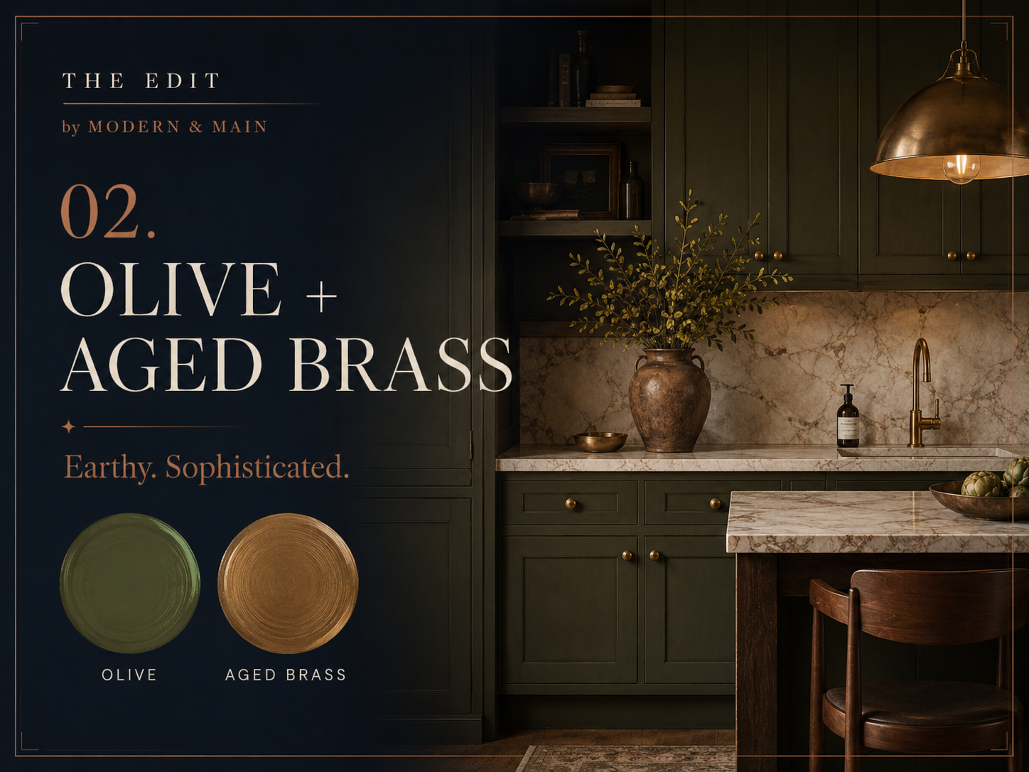
02. Olive + Aged Brass
Earthy sophistication.
Green has been part of the design conversation for several years, but the shades gaining momentum now feel quieter and more complex.
Think less emerald.
More olive, moss, tobacco green, and muted forest tones.
Olive is particularly compelling because it behaves almost like a neutral. It works beautifully with stone, warm white, brown, black, walnut, linen, and brass without demanding all of the attention in the room.
Pairing olive with aged brass adds just enough warmth and polish.
It's a combination that feels equally at home in a traditional European-inspired kitchen, a contemporary powder room, or a beautifully layered bedroom.
How to use it
Olive cabinetry is one of the easiest ways to introduce the palette, particularly when paired with veined stone and warm hardware.
It also works beautifully on:
Built-ins
Interior doors
Powder-room walls
Upholstery
Kitchen islands
Mudroom cabinetry
The key is choosing an olive with slightly gray or brown undertones rather than something overly saturated.
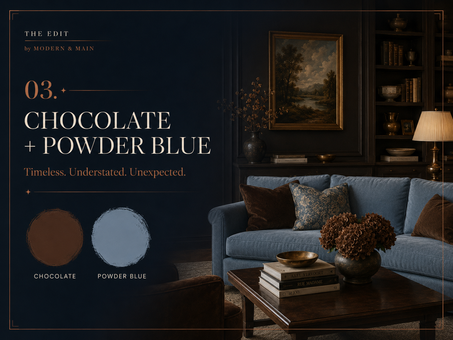
03. Chocolate + Powder Blue
Timeless. Understated. Unexpected.
This may be our favorite pairing of the moment.
Brown has made a major return to interiors, but not in the way many people remember it.
Today's chocolate tones are deeper, richer, and more architectural. They show up in walnut millwork, dark-stained cabinetry, velvet upholstery, stone, leather, and lacquered finishes.
Then comes the unexpected part:
Powder blue.
Against chocolate brown, pale blue suddenly feels sophisticated rather than sweet.
The combination balances masculine and feminine, traditional and contemporary, warm and cool.
It feels tailored without being formal.
How to use it
Try chocolate millwork with blue upholstery, walnut furniture against soft blue-gray walls, or a powder-blue sofa grounded by deeper woods and vintage accents.
If you're hesitant to commit to blue walls, introduce it through textiles first:
Linen drapery
Upholstered dining chairs
Pillows
Rugs
Art
Bedding
The finishing touch
Polished nickel, pewter, or silver-toned accents can be especially beautiful here.
Not every room needs brass.
And that, in itself, is part of the shift we're seeing in design.
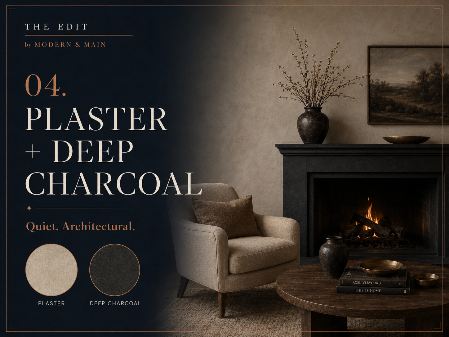
04. Plaster + Deep Charcoal
Quiet architecture.
For those who still love neutral interiors, this may be the evolution of black and white.
Instead of crisp white paired with stark black, designers are gravitating toward warmer plaster, limestone, putty, mushroom, and parchment tones grounded by charcoal.
The contrast is softer.
The effect is richer.
Plaster walls create movement and variation that ordinary paint simply can't replicate, while charcoal gives a room architectural definition.
It's particularly beautiful on fireplaces, doors, cabinetry, window frames, and millwork.
Why texture matters
When you're working with a restrained palette, texture becomes incredibly important.
Layer:
Limewashed walls
Honed limestone
Linen
Wool
Unfinished wood
Leather
Handmade ceramics
Aged metal
The room remains quiet, but it never feels flat.
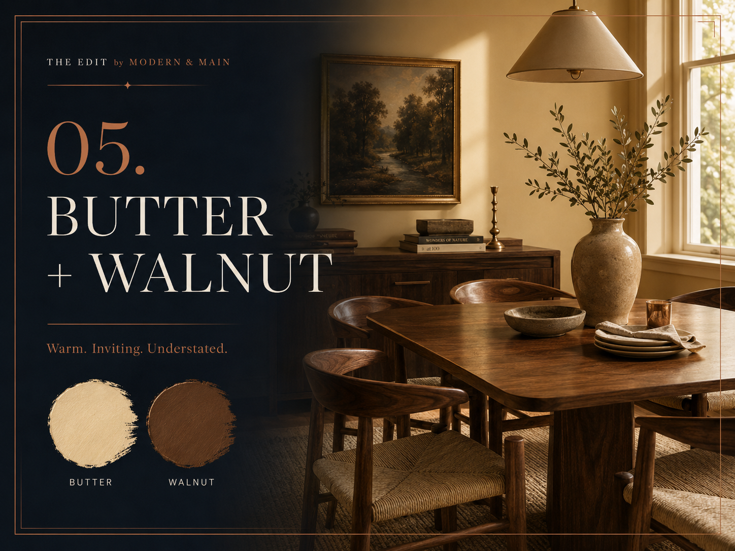
05. Butter + Walnut
Warm. Inviting. Understated.
Yellow is returning to interiors—but perhaps not the yellow you're imagining.
Today's version is soft, creamy, slightly muted, and almost nostalgic.
Think butter rather than lemon.
Paired with walnut, the color suddenly feels grounded and sophisticated.
There is an ease to this palette that feels particularly relevant right now.
After years of cool gray and stark white interiors, people are craving warmth again.
Walnut provides depth while soft yellow brings light.
Together, they create rooms that feel welcoming without sacrificing sophistication.
How to use it
This pairing works beautifully in dining rooms and kitchens, but it can also appear in smaller moments throughout a home.
Consider:
Butter-toned walls
Upholstered dining chairs
Patterned textiles
Painted cabinetry
Vintage rugs
Soft yellow lampshades
Walnut casegoods and millwork
The more muted the yellow, the more elevated it tends to feel.
The Bigger Shift: Less Perfection, More Personality
Perhaps the most important design trend isn't a color at all.
It's the move away from perfection.
For years, beautifully designed homes often followed a very specific formula: one wood tone, one metal finish, one aesthetic, one carefully coordinated furniture package.
We're beginning to see something much more interesting.
The rooms that feel most relevant now are layered rather than matched.
Old beside new.
Dark woods beside lighter ones.
A polished stone table beneath a vintage painting.
Contemporary lighting over antique furniture.
An heirloom chair sitting beside something found on a recent trip.
There is freedom in that approach because it allows a home to evolve.
And the best homes should evolve.
They should tell the story of the people who live there—not the year in which the room was designed.
The takeaway
Trends can be useful.
They give us new ideas, introduce us to colors or materials we may not have previously considered, and sometimes encourage us to take a design risk.
But a trend should be a starting point—not the destination.
The most memorable interiors rarely announce themselves as trendy.
Instead, they have depth.
They have contrast.
They have something unexpected.
Most importantly, they have personality.
Less perfection. More personality. More story. More you.
At Modern & Main, we believe the same principle applies to real estate.
Luxury isn't defined by a particular price point, architectural style, or finish package. It's about the experience a home creates—and finding a space that feels unmistakably your own.
MODERN & MAIN
Redefining luxury through experience, not price.
BUY · SELL · DESIGN · LIVE
Check out this article next